Your homepage has one job. A stranger lands on it, usually on a phone, usually in a hurry, and decides in a few seconds whether you are the one to call. Everything on the page either helps that choice or gets in its way.
I build every site from a blank file, so I get to decide what goes on a homepage and what never makes it there. Below is how I think about it, with four real first screens from sites I built, and a list of what I cut on almost every redesign.
The five second test
Hand your phone to someone who has never heard of you. Open your homepage. Count to five and take the phone back. Then ask them four questions.
What the first screen must answer
- Who
- Your business name, big enough to read without zooming.
- What
- The work you do, in the words your customers use. "Fill dirt and gravel," not "aggregate solutions."
- Where
- The town or area you serve, so a visitor knows you come to them.
- How
- One way to reach you right now. A number that dials when tapped, a quote button, or both.
If they miss any of the four, the first screen is not done. It does not matter how nice the rest of the page is. Most visitors never scroll far enough to find out.
Notice what is not on that list. Your mission statement. A welcome message. "Quality you can trust." Those lines take up the best spot on the page and answer nothing.
Four real first screens
Here is how that test plays out on four sites I built for very different businesses. Each one leads with the thing its customers came for.



Smith Mine: the question is the headline
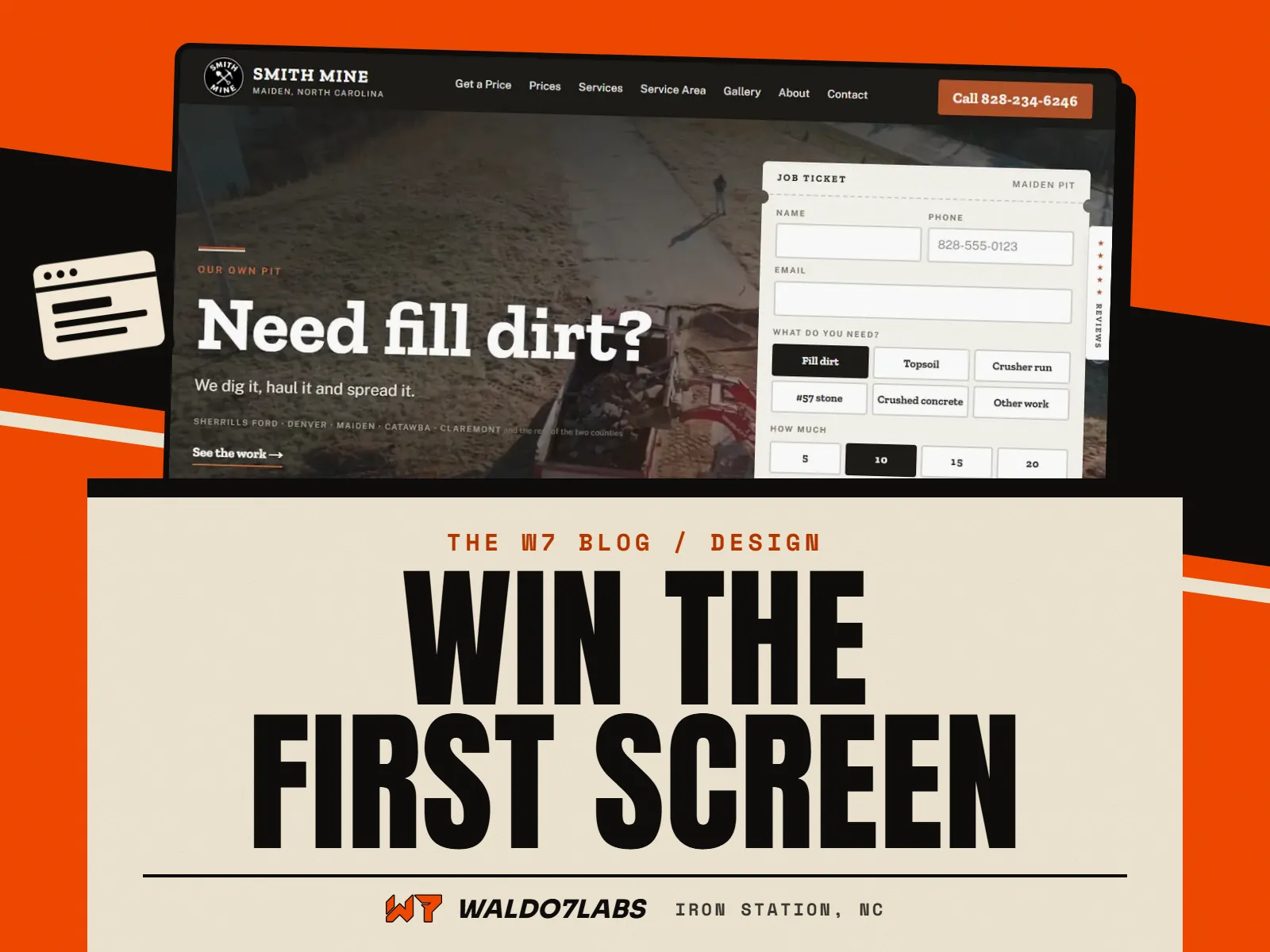
Smith Mine is Matt Smith's fill dirt, gravel and grading business in Maiden. Before the site, every load was priced over the phone, one call at a time. So the homepage opens by asking the customer's own question, "Need fill dirt?", and starts the quote right there. Pick the material, say how much, enter the address, and the site prices the load by real driving distance from the pit.
That is the first screen doing a job Matt used to do himself on every call. You can see the full build on the Smith Mine case study.
Freedom Locksmith: the number, readable on any phone
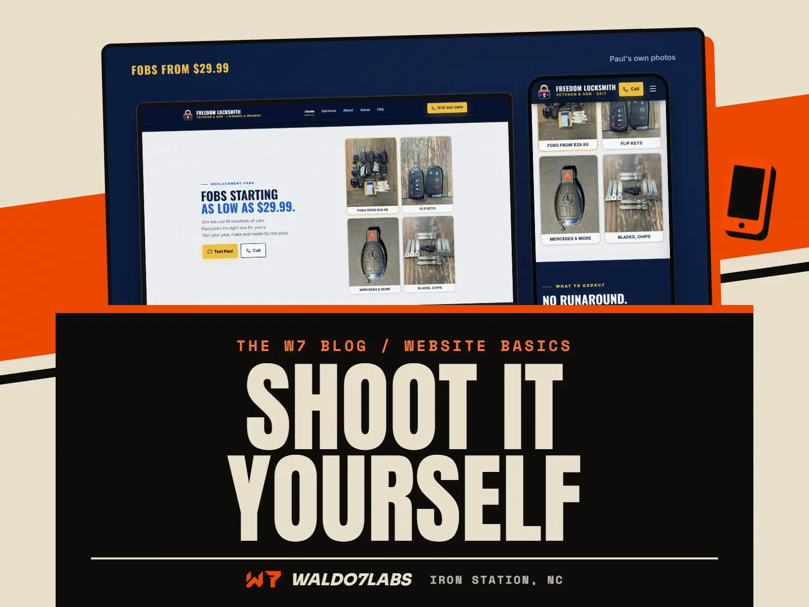
Freedom Locksmith is Paul, a Navy veteran, and his son Todd, running a mobile locksmith out of one truck around Wesley Chapel, Florida. Most of their customers are standing next to a locked car with a phone in one hand, sometimes at night.
So the first screen is a sign with the number on it. I checked it on a 320 wide phone, a 360 wide Android and a 390 wide iPhone, and it reads on all three without zooming. Nothing else on that page matters until the number is easy to tap. More on the Freedom Locksmith build.
Bar-B-Q King: the food and the story, fast
Bar-B-Q King has served Lincolnton since 1971. People look it up for two things: the menu and catering. The site leads with the pit and the family, not stock photos, and the menu is one tap from anywhere. It also opens fast on a phone in the parking lot, which for a restaurant is half the battle. See the Bar-B-Q King case study.
Wicked Kreations: the shop front itself
Cody's custom car shop in Lincolnton gets a homepage that looks like his garage. During his hours the roll up door rises on its own and shows whether he is open right now, his hours, the weather out front, and two buttons: Get a quote and Call. It is the most playful first screen I have built, and it still passes the five second test. Who, what, where and how are all there before you touch anything.
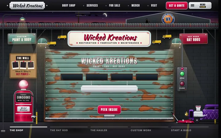
The lesson across all four: fun is fine, clever is fine, but the basics come first. A fancy page that hides the phone number loses to a plain one that does not.
Below the first screen, in order
Once someone scrolls, they are interested. Now they want to know if they can trust you. Here is the order I use for most local service businesses. Restaurants and shops shift it a little, but the idea holds.
- Proof. Your Google rating and a few real reviews, word for word. If you are new and only have one review, show the one. Freedom's site shows Paul's one real Yelp review and does not pretend to have more.
- What you do. Your main services, each with a line and a link to its own page. Not twelve tiny icons. Three to six real services with real words.
- Your own photos. Your truck, your crew, your work. Real photos do more than any line of copy. I wrote a whole guide on taking website photos with your phone.
- Where you work. The towns you serve, said plainly. If you have town pages, link them here.
- Who you are. A short paragraph and a face. People hire people.
- The ask, again. End with the same action as the top. Call, quote, book, or order.
Every section should make the next click easier. If a section exists only because "websites have one of these," cut it.
What I cut on almost every redesign
Cut it
- A slider that rotates five photos and five messages
- Stock photos of smiling people in hard hats
- A wall of text about your values
- Video that plays with sound on its own
- A menu or price list as a PDF download
Do this instead
- One strong photo and one clear line
- Your own photos, even from a phone
- Three short lines a person can scan
- A short muted clip, or a photo
- A real page that loads fast and can be searched
A few of these deserve more than a line.
Sliders
A slider asks the visitor to wait for the message they need. Most people never see slide two. On a phone, the extra pictures make the page slower to load, and Google measures that. One photo, one headline, one button beats five rotating ones nearly every time.
PDF menus and price lists
A PDF opens in a different viewer, is tiny on a phone, and is hard for Google to read. When the specials change, someone has to make a new file. A real menu page solves all of that. Bar-B-Q King's menu is a page, one tap from anywhere on the site. I go deeper on this in what a restaurant website needs.
Auto playing sound
Picture someone checking your site in a waiting room. The page starts talking. They hit back. That visit is gone, and Google notices people leaving fast.
One page, one main action
Pick the one thing you most want a visitor to do. For a roofer it is probably calling or asking for an estimate. For a restaurant it might be the menu, then ordering. For a shop it is browsing products.
That action gets the strongest button, in the same color, every time it appears. Other actions can exist, but they should look like second choices. When every button is loud, none of them are.
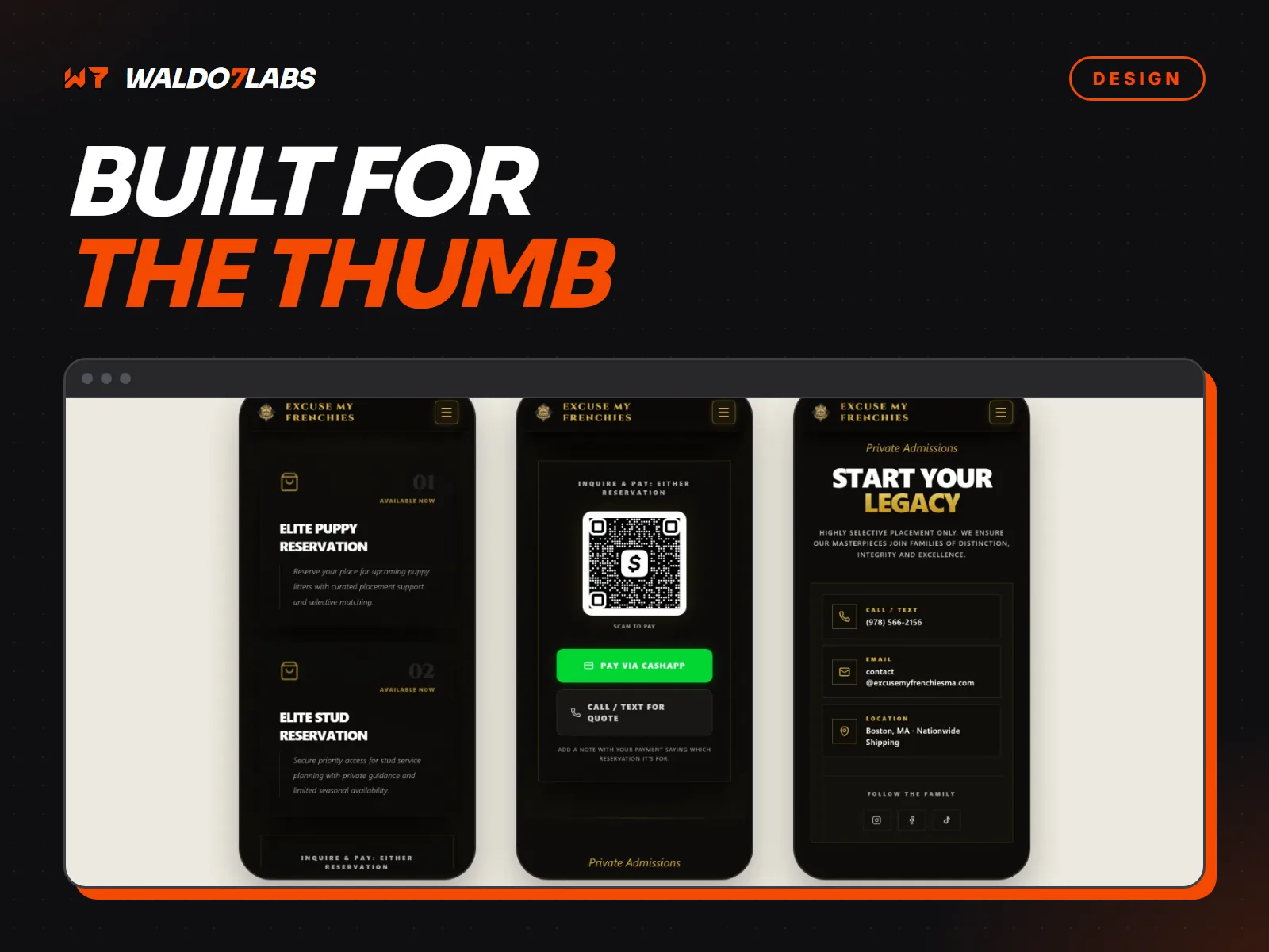
On a phone, the call button should sit where a thumb can reach it, and the number should dial when tapped. It sounds basic. I still find homepages every week where the number is an image or plain text that does nothing when you tap it. My post on designing for the thumb covers the rest of the phone side.
Check your own homepage tonight
Run this on your phone, not your computer
- Your business name and what you do are readable before you scroll
- The town or area you serve is on the first screen
- Tapping the phone number starts a call
- There is one main button, and it says what happens ("Get a quote", not "Submit")
- No slider, no sound, no pop up the moment it loads
- Your Google rating or a real review shows up within one scroll
- The photos are yours, not stock
- The page loads in a few seconds on cell signal, not just Wi-Fi
- The bottom of the page asks for the call again
If you missed more than two, the homepage is probably costing you calls. You can run the free site check for a second look at speed and the basics, or go through the longer 21 point website checklist.
How I build a homepage
Every site I make starts with the questions your customers ask before they call. Then I design the first screen to answer them, and you see a free preview of the top of your homepage before you pay anything. If you love it, your first payment starts the full build. Starter Sites start at $795 right now, the launch price for my first 10 local businesses, then $1,295, with every current number on the pricing page.
Want to see more first screens first? Every site on the work page is live, and you can try them on your phone. Or read how the whole build runs on the websites page.
Quick answers
What should be on the first screen of a homepage?
Who you are, what you do, where you do it, and one way to reach you right now, like a phone number that dials when tapped. If a stranger on a phone cannot tell those four things before they scroll, the first screen needs work.
Are image sliders bad for a small business homepage?
Usually, yes. Most people never see past the first slide, the moving parts slow the page on a phone, and the message keeps changing before anyone reads it. One strong photo with one clear line does the job better.
How long should a homepage be?
Long enough to answer the questions that decide the call, and no longer. For most local businesses that is the first screen, proof, the main services, real photos, where you work and a closing way to reach you.
Should I put my prices on my homepage?
If people always ask, give them something honest, like a starting price or a calculator, and link to the details. Smith Mine's site prices a load of dirt on the spot, which answers the first question every caller used to ask.
Do I need a video on my homepage?
No. If you use one, keep it short, muted, and never the only way to learn what you do. Video that plays with sound on its own sends people back to Google.